
The first Edison Artisan Lamp was created as a one-off build by Arthur Prestidge, who wanted a functional light that captured the 19th century spirit of the Thomas Edison bulb, a piece that reflected as much about history as it did the craftsmanship. Arthur, a life-long carpenter and joiner worked with his son over many months to develop the Edison Artisan Lamp range. By sheer coincidence, in low light the Edison Artisan Lamp visually came to life, the precision voltage regulating device exposing the beauty of the hand-woven tungsten filaments in the squirrel cage, framed by the ageless glass silhouette of the lamp itself, creating a truly stunning and evocative image. Having developed the range, Arthur approached Digital Paint to create a web site that enabled online sales and could display the range of lamps.
Approaching this project, we gathered the Marksman, Creator, Engineer and Tracker to a meeting. The task was simple, create a beautiful E-Commerce web site which would facilitate online sales.
Scoping
Having explored the whole lamp range for weeks, the team had a scoping session with the client to clarify the brief and to understand what the client was ultimately looking for. At this stage, Marksman Develop the existing brand into one of prestige, akin to Burberry or Porche and create a custom built ecommerce website which reflected the new aspirational positioning.
Creative
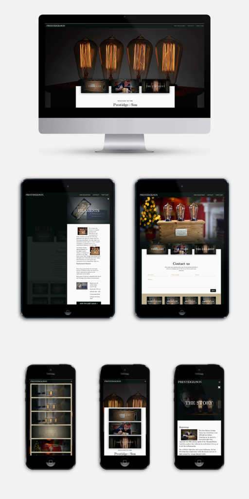
The creative approach for this project was to harness the visual beauty of the lamps themselves. We really wanted to capture the stunning light art created by the filaments and represent the prestige of the artisan market, so captured the units in situ within luxurious environments using photographic and video execution.
Marketing
The marketing approach harnessed conspicuous consumption and social mobility theory within its pricing and communications methods to forge an aspirational brand, as rich visually as it was verbally, capitalising on the hand crafted, artisan quality of the products, with language tones specifically chosen to adequately.
Branding
In light of the new move to being a high-end brand, the team decided to redesign the language tone and appearance of the brand. Creator went to town on developing a logo with a layered intertwining ampersand and an injection of colour, reflecting the stunning Prestidge & Son packaging.
UI/UX
Simple to use, easy to navigate, responsive, sophisticated and savvy, the user interface was designed to reflect the customer. The experience was designed to maximise tangibility and provide a dramatic light experience.
In December 2016 we launched the first Prestidge & Son web site. It is responsive, simple, refined and beautiful. Dramatic video footage, creatively directed by us takes subtle prominence, behind content that both we and the client are very proud of. This website reflected the superhero abilities of the Digital Paint team, and will continue to do so as we work for Prestidge & Son to develop their Marketing and Social Media presence.
What the guys at Digital Paint did was fantastic. They perfectly interpreted what I wanted and over delivered ahead of schedule. The team went above and beyond on this project and I cant say enough about the service.
Arthur Prestidge,
Owner, Prestidge & Son Lighting Co.